We admire masterworks in museums for, among other things, their brilliant colouring, their longevity due to the painter's technical expertise and for the evidence of the artist's hand in the brushwork. Many paint effects from the past seem nearly unattainable with modern materials and this has lead artists to try to rediscover secret formulas or find additives that emulate historical processes. Resins, wax, and complex chemical mixtures have all been tried. Research done by the National Gallery in London however has revealed that linseed oil, coloured pigment and additions of calcium carbonate are the sole ingredients in many master works before the 20th century.
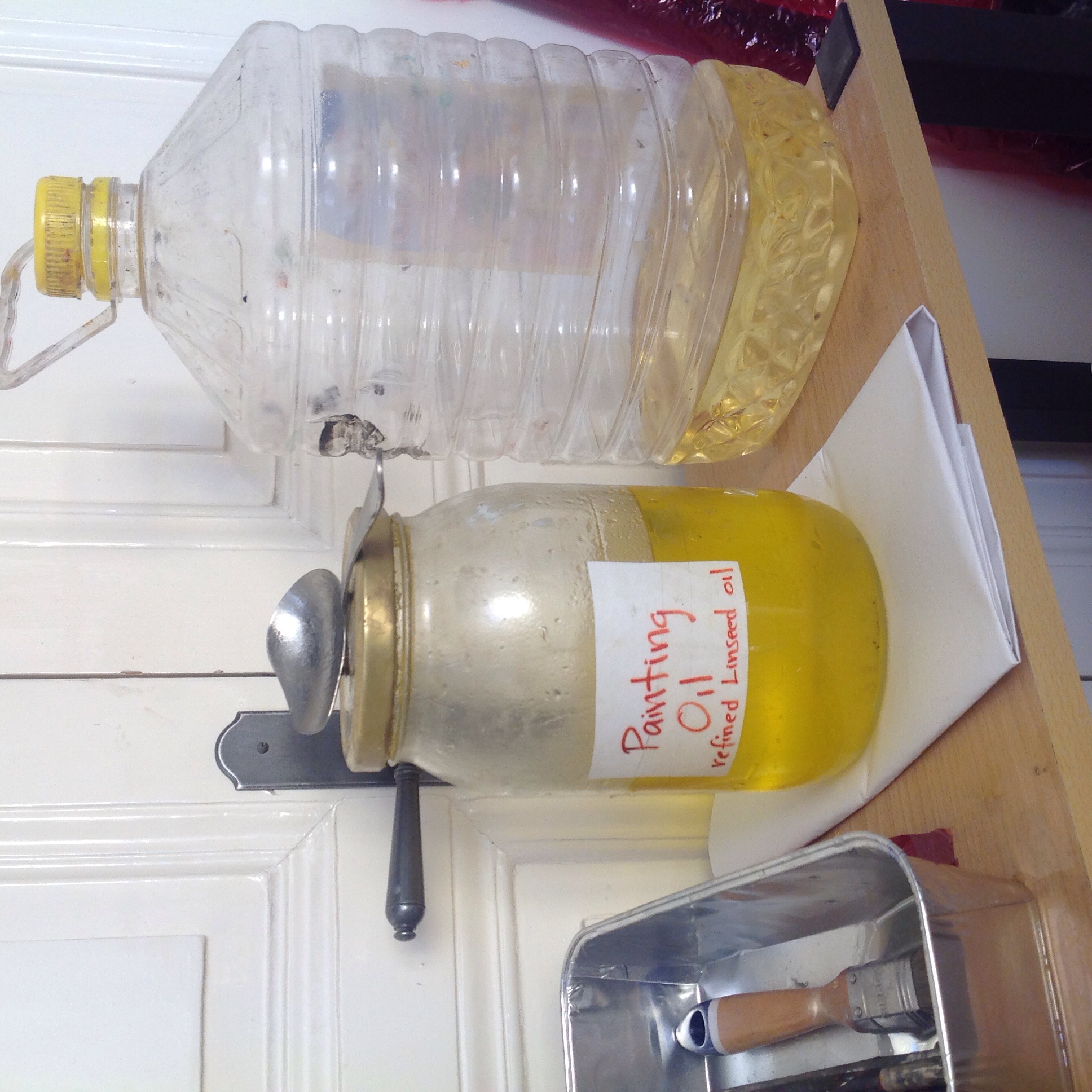
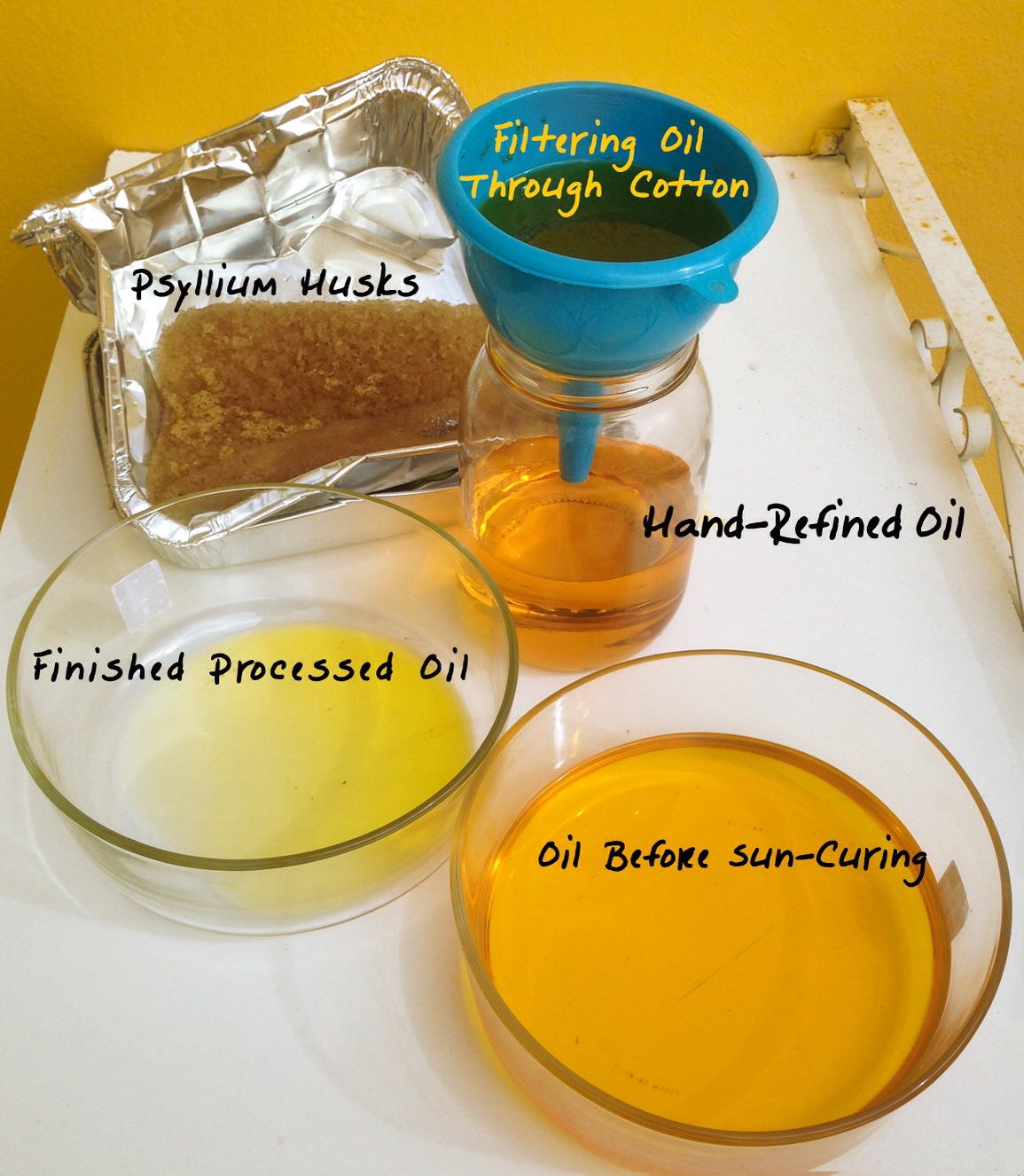
Though we are seduced by the ubiquitous presence of modern materials, traditional methods are intriguing and wonderful to investigate. Egg tempera and encaustic have both had a renaissance in the last twenty years. The fundamental substance of oil painting however, which is the oil itself, has been accepted as standard by most artists. Modern linseed oil is alkali cleaned and heated, it is no longer manually pressed and sun thickened as it was. Some artists with curious minds have now reexamined the refining of the flax oil. Louis Velasquez and Tad Spurgeon both have websites dedicated to methods of hand refining oil to produce a non yellowing, flexible, fast drying oil which completely transforms the painting process. What they have uncovered in their investigations is a remarkable way to access an old and very successful formula.
My involvement in this exciting investigation began when I assigned Velazquez, the 17th century painter, as the topic of my advanced painters seminar. We looked into the addition of marble dust, a form of calcium carbonate, to his paint. I stumbled on the information about hand refining oils then but felt it was too intensive to delve into at the time. It took me several more years and further seminars on Rubens and Rembrandt before I took the plunge and followed procedures I had read about online. The results are quite amazing to me, the difference from the handling of modern tube oils is significant. The hand refined oil makes many things possible which I had read about and seen but had not been able to obtain. I always felt tube oils were too slippery, too thin, too flat once dry. I also found the suede effect annoying and could not build up impasto areas without needing many days of drying time. The hand refined oil has none of these defects.
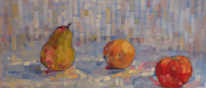
This semester I introduced the new oil to students and we worked together to understand its potential. It is more flexible, shinier and forms a tougher film than the tube oils. The viscosity of the paint allows one to paint wet into wet without loosing brushstroke integrity and colour purity. It is far more transparent, the glazes are deep and clean, it dries evenly and quickly and doesn't seem to darken as much. Impasto areas can dry overnight, depending on the weather, and keep their sharp edges and texture.
The best part of all of this is that solvent has been banished from the studio. We clean our brushes in vegetable oil and never thin paint with solvent. The smell of the new oil is something like fresh grass or fields of flowers. Because we mix it 1:3 with chalk and then use that 2:1 with tube paint our paint supply goes much further. It is hard on brushes though, they wear down quickly. One wonderful advantage is the ability to wipe off the paint completely from a dry underlayer making changes in plan easy to execute.
There has been a complete change in my approach to paint and the student work is richer and more colourful. We are able to work into surfaces more quickly which speeds our process. The studios are no longer redolent with turpentine and the improved environment is beneficial for all who share our space.
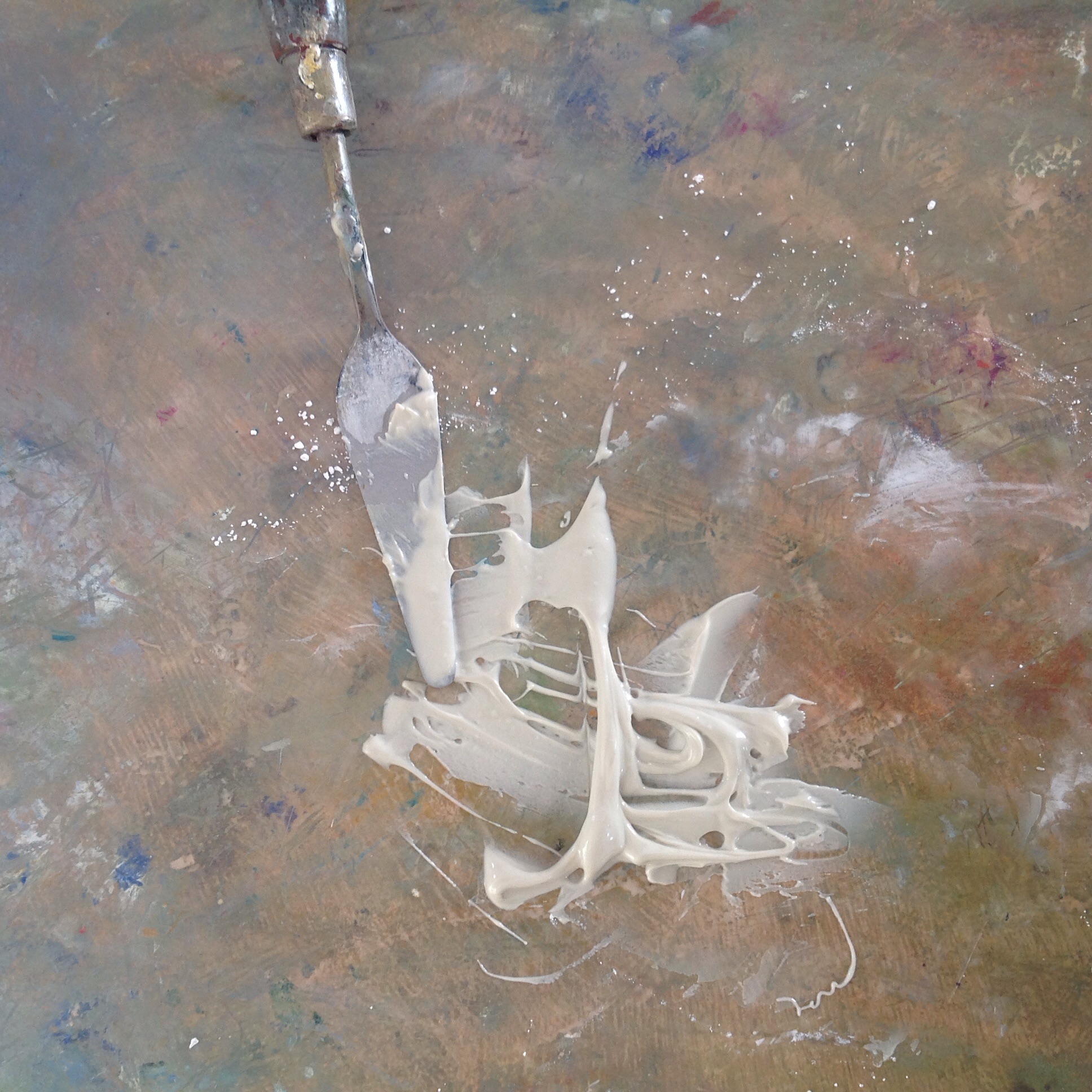
The viscous chalk and oil mixture